TornTicker Login Page
The TornTicker login page is the entry point for users to authenticate with their Torn API Key and access the dashboard.
Responsive Views
The login page is fully responsive and adapts to different screen sizes and orientations. Below are the different layouts:
| X-Small | Small | Medium + | |
|---|---|---|---|
| Overlay | 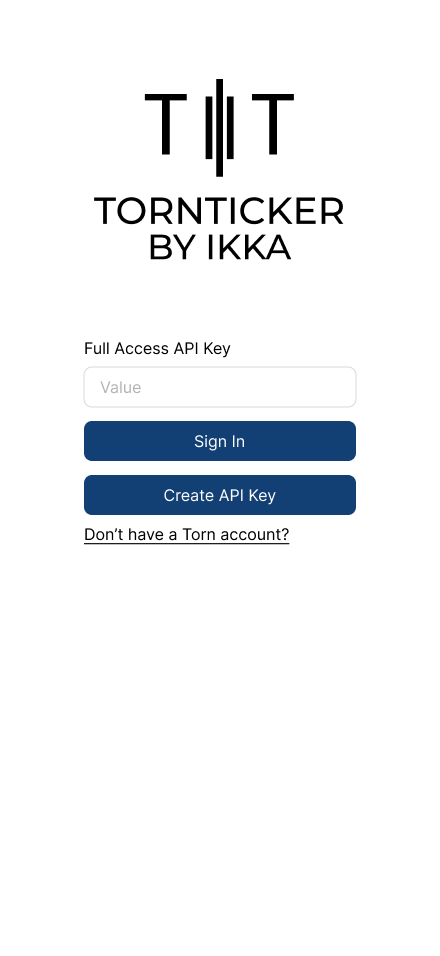 | 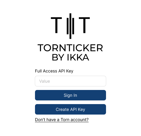 | 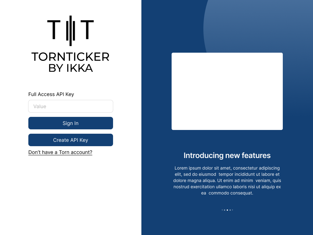 |
| Full Page | 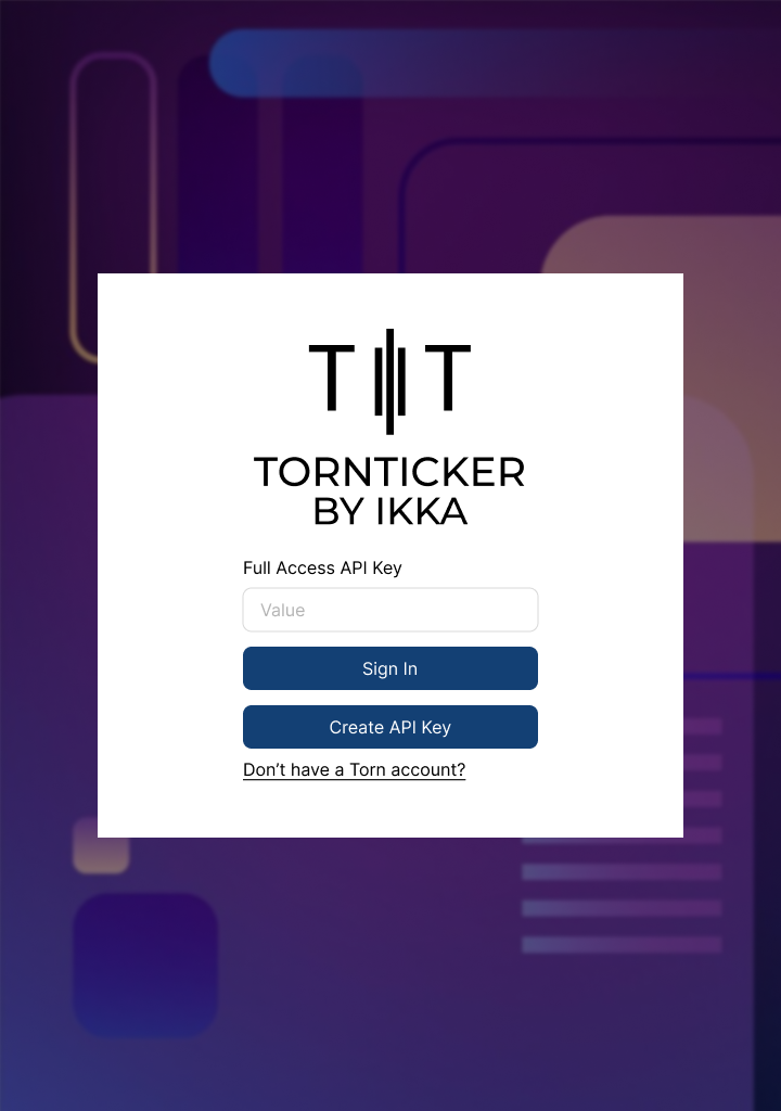 | 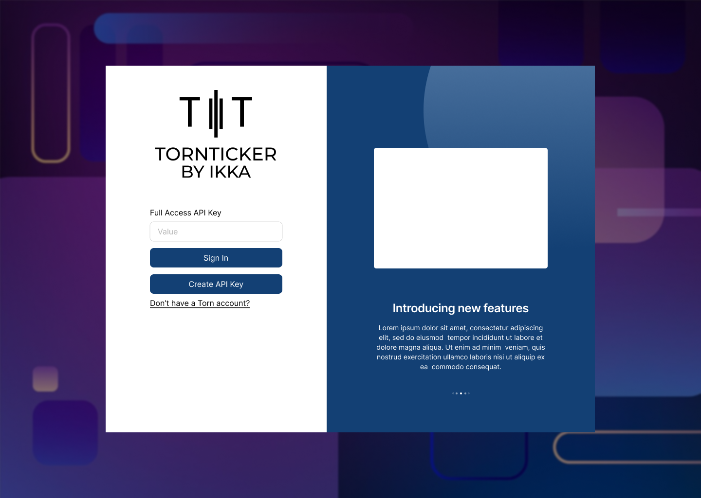 |
Frontend
Login Overlay and Layout
The login overlay consists of two main sections: the login form on the left and the feature carousel on the right. The structure follows a grid-based layout using Bootstrap's grid system.
Overall Structure
div.login-wrapper: A full-screen overlay with a 10px blur effect applied to the background.Container.login-modal: The main container for the login overlay.- Grid Layout:
- Left Section:
<Col xs={12} md={5} className='px-5 login-container'>- Takes up full width (
xs={12}) on small screens. - On larger screens (
md={5}), it occupies 5 out of 12 columns.
- Takes up full width (
- Right Section:
<Col md={7} className='feature-container d-none d-md-block'>- Occupies 7 out of 12 columns on
mdand larger screens. - Hidden on small screens (
d-none d-md-block).
- Occupies 7 out of 12 columns on
- Left Section:
Login Form (Left Section)
The left side contains the LoginForm component, which manages the user input and authentication flow.
Components
LoginFormComponent- Accepts a
signInfunction as a prop. - Displays the TornTicker logo at the top.
- Contains a React-Bootstrap form with an API key input and submission button.
- Includes links for API key creation and Torn account registration.
- Accepts a
Elements within LoginForm
- Logo: Positioned at the top.
- Form Elements:
<Form.Control>: Input field for entering the Torn Full Access API Key.<Button>: Sign-in button that triggers thesignInfunction.- "Create API Key": A hyperlink styled as a button, directing users to the Torn API settings page.
- "Don't have a Torn account?": A hyperlink leading to a referral page for new users.
Feature Carousel (Right Section)
On larger screens, the right section features a carousel displaying TornTicker’s features.
Data Source
features-data.js:- Exports an array of feature objects, each containing:
id: Unique identifier.img.src: Image source URL.img.alt: Alt text for accessibility.title: Feature title.text: Description of the feature.
- Exports an array of feature objects, each containing:
Components
FeaturesComponent:- Imports
features-data.jsand maps through the data. - Creates a Bootstrap Carousel where each slide is a
Featurecomponent. - Structure:
<Carousel.Item>
  <Feature key={feat.id} {...feat} />
</Carousel.Item>
- Imports
FeatureComponent:- Accepts props (
img.src,img.alt,title,text) and displays:- Feature Image (positioned at the top).
- Title (styled as
<h3>). - Description Text (styled as
<p>).
- Accepts props (
Carousel Behavior
- Supports automatic rotation through multiple slides.
- Hides on small screens (
d-none d-md-block) to maintain a simple layout on mobile.